Button Filled Variant
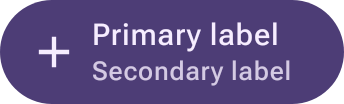
button-filledvariant__ideal__icon-large__compact
98 views
current
The kit's highlighted style — a filled button in the variant palette.
Issues#294#326
- #294 `:remote-catalog`: four fixture divergences make the compare page report content differences as component defectsclosed · area:preview · parity:catalog
- #326 Upstream: `filledVariantButtonColors()` resolves `secondaryContentColor` to near-black on its own dark container — 2.07:1 against Wear's 5.95:1closed · area:component · parity:upstream
index as of 2026-10-20 11:12 UTC
View
Size
Exploded 3D
One sheet per visible drawing level. Structural-only
composables are kept in the next sheet's breadcrumb. Rides the SVG link and download.
Locale & text
Overlays
Overrides
Declared overrides — edit a value to re-render.
Compare10 variants of Button Filled Variant, against Design referenceM3 Wear OS Apps Design Kit

 ideal/default/compactnot scorednot scored

 ideal/disabled/compactnot scorednot scored

 ideal/icon-disabled/compactnot scorednot scored

 ideal/icon-extra-large-disabled/compactnot scorednot scored

 ideal/icon-extra-large/compactnot scorednot scored

 ideal/icon-large-disabled/compactnot scorednot scored

 ideal/icon-large/compacton the stagenot scorednot scored
 ideal/icon/compactnot scorednot scored

 ideal/left-disabled/compactnot scorednot scored

 ideal/left/compactnot scorednot scored